This article introduces an interesting project that combined two of my professional interests: design and education. Specifically, I describe the educational rationale and creative process involved in the design of the Yinhai Academy (later Milton School) House logos.
Background
I moved to Yinhai Academy late in 2017 to work primarily as a high school English writing instructor. I also taught a couple of middle school art classes each week. At this time a colleague was busy constructing a House system as a means of engaging and motivating students with a secondary aim of supporting the disciplinary system that was also under development. I had collaborated closely with this colleague in a pilot version of the House system where my middle school art students helped to design the logo for their respective teams. Since I was already engaged in the project in my capacity of art teacher, my colleague approached me to design the official logos for the Houses.
Design Considerations
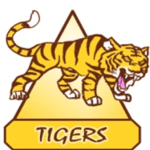
There were numerous discussions among the management team as to what the House names and logos would be and it was eventually agreed that they would be three animals (eagle, tiger and shark) representing power and the top of the food chain in their respective domains – air, land and sea – and the fourth would be a dragon, again representing power. The idea being that these would create a healthy competitive image and they are perfectly acceptable to the local (Chinese) and international cultures at the school (an issue that had caused a bit of a situation during the pilot version). Each House was also given a colour and a shape so the logos could be simplified if necessary. We chose shapes which, in their own way, could all symbolise strength or power through teamwork.
My job was to put all this into a logo design for each House. We decided very early on that the logos had to be similar enough to create a coherent, almost corporate image when displayed together. My colleague and I also had a plan to allow the students to design a new logo each academic year to promote student ownership of the Houses, so there was never any intention for me to spend too much time perfecting the logos.
Design Process
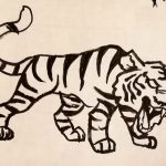
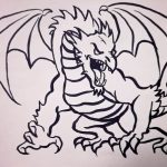
Mindful that the aim was to make the designs replaceable, and the fact that I was actually on unpaid leave when the request to design the logos came through, speed of production seemed the way to go. To this end, I decided to use the technique that many of the older art students rely on and trace the designs. I simply Googled logos for each animal and dragon, plonked a piece of paper directly on the computer screen and, armed with a brush and ink, quickly traced parts of three different designs. To further ensure the designs were sufficiently dissimilar so as to avoid copyright issues, I used very rapid brushstrokes to reduce the similarity.
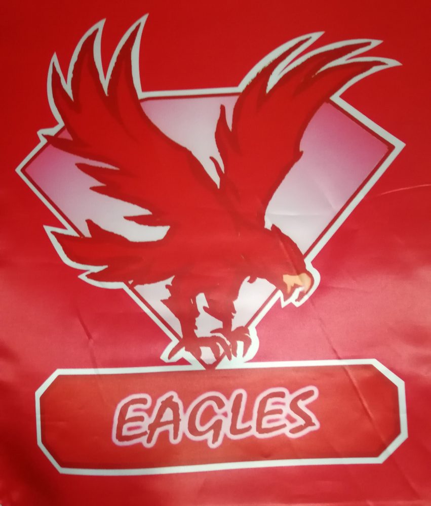
EAGLE missing in action!
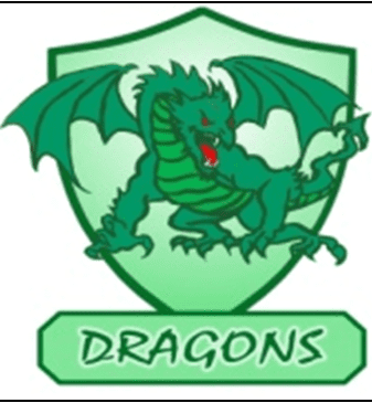
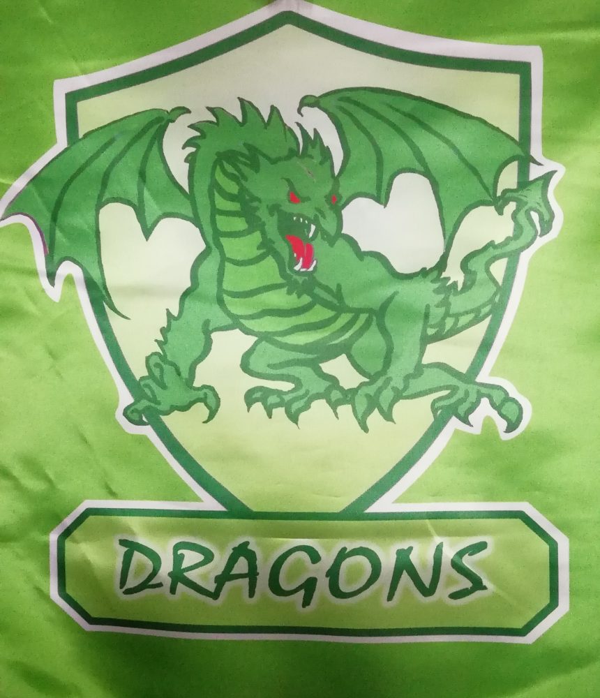
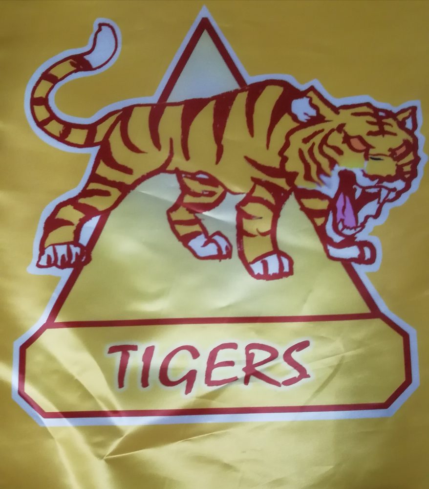
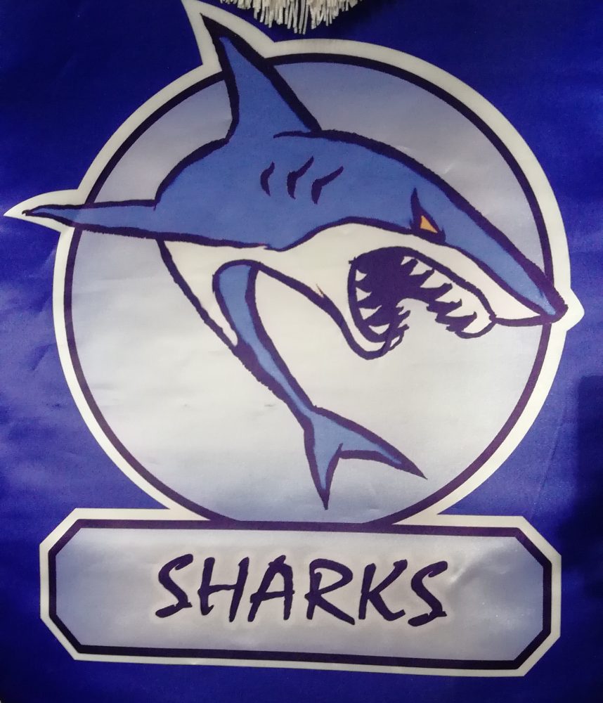
Next, I digitised the four brushstroke images and changed the black ink into a dark tone of each House’s colour. I deleted any unwanted brush marks, spots or bleeding and then digitally filled the characters with a bold tone of their respective House colours. I slapped a basic shape representing each House behind the animal character, gradient filled it with a slightly different shade of the House colours and added the name of each team in a box at the bottom of each logo. After approximately 20 mins work on each logo, they were finished.
Here are the results as seen on the House flags:
Educational Value
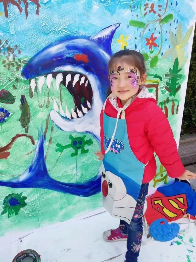
As mentioned above, I had been collaborating closely with my colleague who was building the House system so, when I returned to the school, I was keen to use the new logos in my middle school art projects to help support and promote the House system. This work consisted of two main projects. The first was for the students to create a kind of banner for their House to display on the school’s Sports Day. The second was to encourage the students to enter a competition to redesign their House logo. Since these two projects ran at more or less the same time, many of the teams used the entries into the design competition to decorate their team banners. The work was quite fun and very productive but unfortunately I have lost most of the photos.
To date, the only team who voted for a change of logo was House Tigers with the proposed replacement a student design (I do not have a picture of this, but it was quite cute). Unfortunately, this change was never realised due to the COVID19 outbreak and the rebranding of the school for which the leaders wanted to keep the original ‘corporate’ images. Thus, at the time of writing, seven years after the original designs were created, my logos are still representing Milton School’s House system. It is interesting to observe that these four simple designs that I bashed out in around 80 minutes of unpaid work have, in terms of volume produced, become my most widely distributed designs – hundreds of students and their family members and friends own their team shirts, and they adorn numerous flags, cups, trophies and other miscellaneous merchandise.
The Last Word
It has been a pleasure to have been involved in this interesting project and to be able to use my designs to motivate students to develop their team working skills and creativity.

